深入探索 CSS
Introducing the CSS Box Model
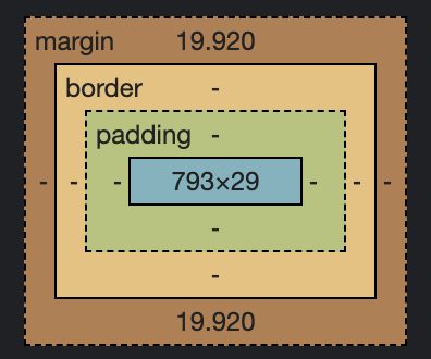
每個 HTML 標籤彷彿被裝在一個盒子裡,因此有盒子模型之稱。
如下圖所示,盒子模型的最外層為 margin,最內層為 content。
Understanding the Box Model
以下是盒子模型相關的常用 CSS 代碼
p {
  margin: 20px;
  padding: 20px;
  border-width: 5px;
  border-color: black;
  border-style: solid;
}
上述範例中,倒數三行可用一行縮寫表示:
p {
  border: 5px black solid;
}
Understanding Margin Collapsing and Removing Default Margins
以 Chrome 為例,瀏覽器對於 body 標籤有預設 margin: 8px 的設定,
因此通常會在 CSS 檔的開頭添加以下樣式,以免排版不如預期。
body {
  margin: 0;
}
Margin Collapsing
Margin Collapsing(邊距合併)係指在特定情況下,
兩個相鄰元素的外邊距(margin)會合併成單一的外邊距。這會影響元素之間的間距與定位。
Theory Time - Working with Shorthand Properties
除了先前解說過的 border,某些 CSS 樣式也可用簡寫表示,例如 margin 系列。
/* 四個方向的 margin 無特定邏輯時 */
p {
  margin-top: 38px;
  margin-right: 25px;
  margin-bottom: 13px;
  margin-left: 47px;
}

/* 縮寫 */
p {
  margin: 38px 25px 13px 47px;
}
/* 水平方向及垂直方向的 margin 成對時 */
p {
  margin-top: 5px;
  margin-right: 10px;
  margin-bottom: 5px;
  margin-left: 10px;
}

/* 縮寫 */
p {
  margin: 5px 10px;
}
/* 四個方向的 margin 相同時 */
p {
  margin-top: 20px;
  margin-right: 20px;
  margin-bottom: 20px;
  margin-left: 20px;
}

/* 縮寫 */
p {
  margin: 20px;
}
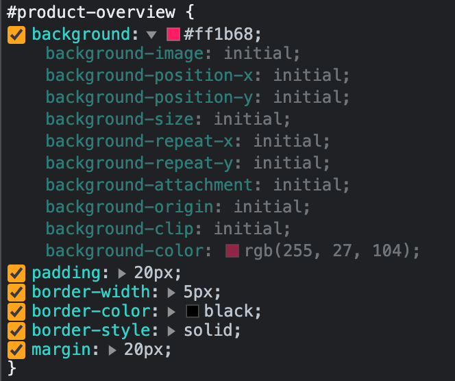
Applying Shorthands in Practice
如下圖所示,從 Dev-Tools 可檢視縮寫樣式的細部分解。
例如 background: 後方的三角形,點擊可隱藏或顯示其詳細樣式。
Diving Into the Height & Width Properties
Block-level content 的預設寬度為瀏覽器寬度的 100% height: n% 的實際高度受限於親容器的高度
p {
  /* 將寬度設為 50% */
  width: 50%;

  /* 將寬度設為 50px */
  width: 50px;

  /* 將高度設為 50% */
  height: 50%;

  /* 將高度設為 50px */
  height: 50px;
}
Understanding Box Sizing
Box Sizing 是 CSS 屬性之一,在代碼中預設值為 box-sizing: content-box
此時 height 及 width 的對象為 content,但此設定在實務上並不直觀。
將 Box Sizing 設定為 box-sizing: border-box 是較為直觀的作法。
此時 height 及 width 的對象為 border + padding + content 的長度與寬度。
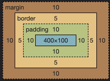
/* 將 box-sizing 設定為 content-box(預設值) */
p {
  width: 400px;
  height: 100px;
  padding: 10px;
  border: 5px black solid;
  margin: 10px;
  box-sizing: content-box;
}
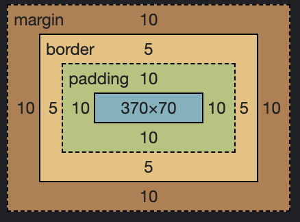
/* 將 box-sizing 設定為 border-box */
p {
  width: 400px;
  height: 100px;
  padding: 10px;
  border: 5px black solid;
  margin: 10px;
  box-sizing: border-box;
}
實務起手式
由於實務上會希望每個元素都套用 border-box 設定,因此通常會在 CSS 檔的頂端加入下列代碼。
* {
  box-sizing: border-box;
}
Understanding the Display Property
藉由 display 屬性可將元素的顯示模式改為 block / inline / inline-block
a {
  /* 以區塊元素顯示 */
  display: block;

  /* 以行內元素顯示 */
  display: inline;

  /* 以行內區塊元素顯示 */
  display: inline-block;
}
display: none vs visibility: hidden
HTML 套用 visibility 或 display 屬性都能使其從排版消失,
但兩個屬性之間有不同的機制。
/* 隱藏特定元素,但該元素仍佔有版面 */
p {
  visibility: hidden;
}
/* 不顯示特定元素,該元素不佔有版面,但仍屬於 DOM 的一部分 */
p {
  display: none;
}
Working with "text-decoration" & "vertical-align"
套用 text-decoration 屬性可移除連結文字的底線。
a {
  /* 移除底線 */
  text-decoration: none;

  /* 添加底線(預設值) */
  text-decoration: underline;
}
套用 vertical-align 屬性可調整元素的垂直對齊規則
a {
  /* 垂直置中 */
  vertical-align: middle;
}
The vertical-align CSS property sets vertical alignment of an inline, inline-block or table-cell box.
vertical-align
Theory Time - Pseudo Classes & Pseudo Elements
偽類別及偽元素好比 CSS 的條件式,
可使特定類別或元素在符合特定條件下變更 CSS 樣式。
selector:pseudo-class {
  property: value;
}

/* Any button over which the user's pointer is hovering */
button:hover {
  color: blue;
}
selector::pseudo-element {
  property: value;
}

/* The first line of every <p> element. */
p::first-line {
  color: blue;
  text-transform: uppercase;
}
Adding a Background Image to our Project
background 屬性除了指定色票,也可指定圖片路徑。
#an-element {
  background: url("route");
}
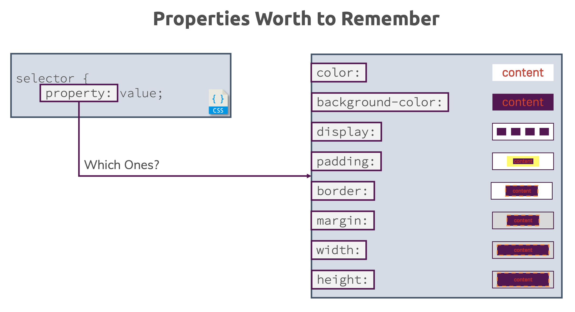
Properties Worth to Remember
以下是常用、值得熟記的 CSS 屬性。
兩個以上的偽類別可以群組化,例如:
/* 當滑鼠游標位於最後一個 div 時,套用指定樣式 */
div:last-of-type:hover {
  property: value;
}